When oil moves twenty five percent in a month, the headline writes itself. Oil is up, so the market must be down, and the reason must be the conflict in the news.
The first half is true. The second half is not, at least not in the way most coverage puts it. Over the month to 14 September 2026, front month WTI rose about twenty five percent. Over that same month the S&P 500 fell about two percent. That is not a market in trouble. That is a market absorbing a supply shock unevenly, which is what markets do.
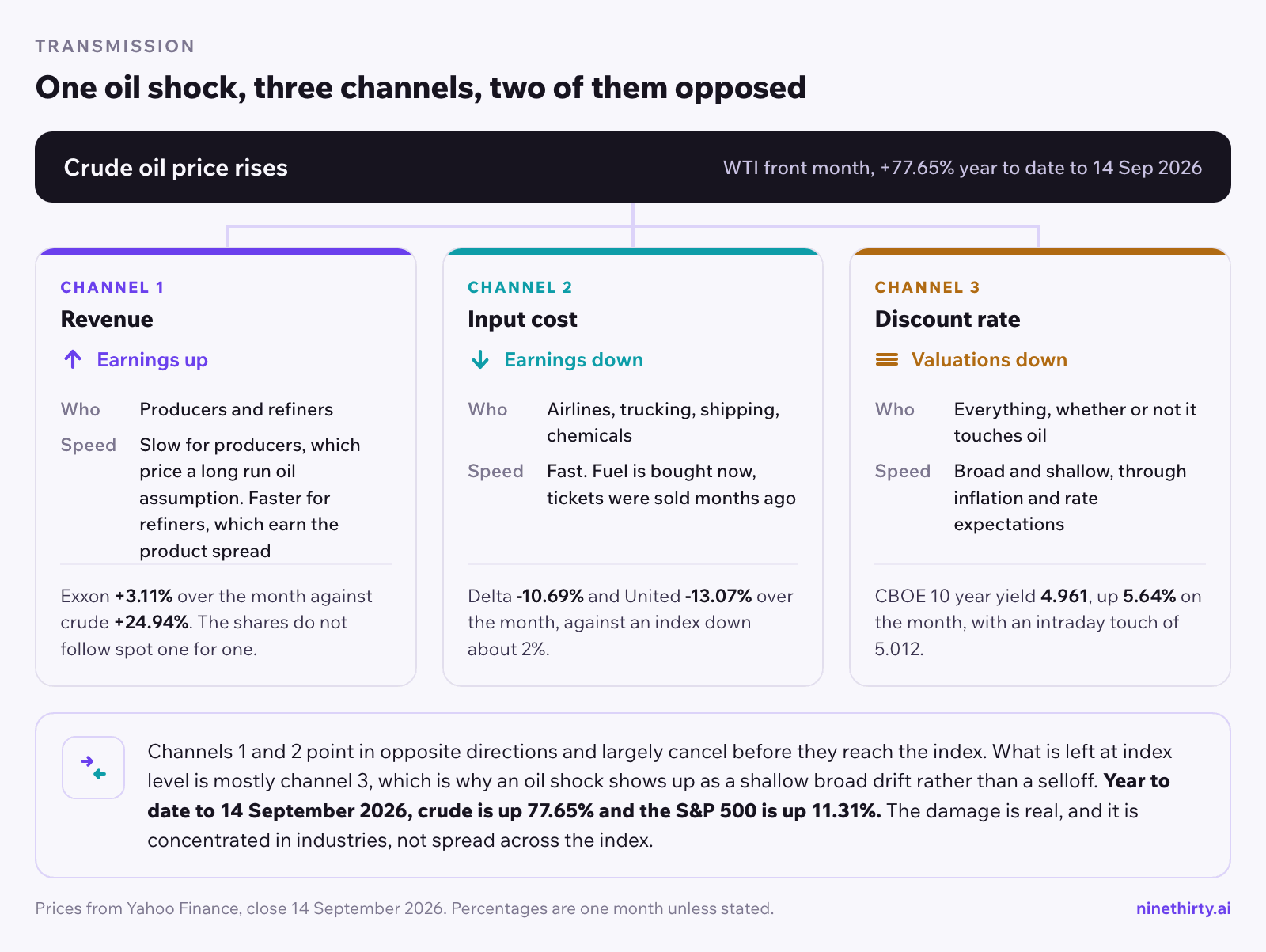
The uneven part is the interesting part. An oil shock does not arrive as a general fall in share prices. It arrives through three specific channels, it hits different companies at different times, and by the time it reaches the index it has mostly cancelled itself out. If you want to trade around it, or simply understand what you are holding, the channels matter more than the index.
How does an oil price shock actually reach stock prices?
Oil is an input cost, a revenue line, and an inflation component. Every equity response traces back to one of those three roles.
As a revenue line, a higher crude price lifts the earnings of companies that pull oil out of the ground and sell it. This is the most direct channel and the fastest to price. It is also the narrowest, because energy is a small slice of a US index by weight.
As an input cost, a higher crude price cuts the earnings of companies that burn fuel to operate. Airlines are the clearest case, because jet fuel is one of their largest single expenses and they cannot pass it through quickly. Trucking, shipping, chemicals and anything that runs a fleet sit in the same channel.
As an inflation component, energy feeds the price indices that shape interest rate expectations. This is the slowest channel and the broadest. It does not care what a company sells. It reprices the discount rate applied to every future dollar of earnings, which is why a long duration growth stock can fall on an oil headline while having nothing to do with oil.
The three channels have different speeds and opposite directions. The first pushes up, the second pushes down, and the third pushes down on almost everything. Net them against each other and you get roughly what the index did, which is very little. That cancellation is the reason “the market is down because of oil” is usually the wrong sentence.
What is actually happening in the Strait of Hormuz
The supply risk behind the price is specific and it is measurable, so it is worth stating plainly rather than gesturing at “tensions”.
The Congressional Research Service reports that in 2025, before the current conflict, roughly 25 percent of the world’s maritime trade in crude oil and petroleum products passed through the Strait of Hormuz, along with roughly 19 percent of liquefied natural gas. In barrels that was about 20 million per day, which CRS puts at approximately 34 percent of global crude oil trade and roughly 20 percent of world petroleum liquids consumption. Those three shares are not interchangeable and coverage often blurs them. The consumption share is the one that matters most for a price move, because it is the share of what the world actually burns.
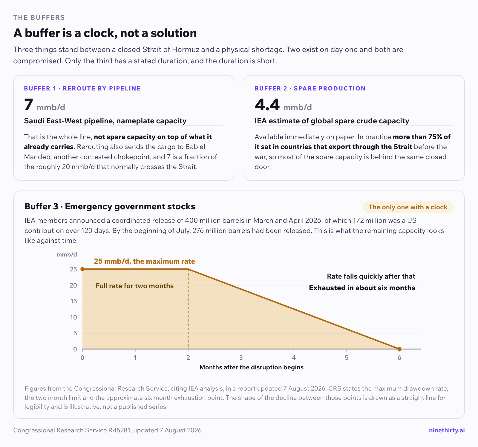
The waterway is about 22 nautical miles wide at its narrowest. CRS lists the reasons it is a chokepoint: no alternative seaborne route, limited land based bypass capacity, and a history of disruption during conflicts. Saudi Arabia can push more crude through its East-West pipeline to the Red Sea, a line CRS sizes at approximately 7 million barrels per day of total capacity, but that pushes the cargo toward a different chokepoint at Bab el Mandeb rather than removing the risk.
US and Israeli operations against Iran began in late February 2026. CRS describes what followed as a “precipitous drop in cross-Strait traffic”, and its August 2026 assessment is that attacks on shipping and retaliatory strikes “have severely disrupted traffic through the Strait for most of the past five months”. After the memorandum of understanding signed on 17 June, CRS records that crossings temporarily increased, though not to their pre-war averages. It did not hold. Conflict resumed in July, and CRS reports that by mid July the volume of attacks was higher than at any point since April 2026, after which the MOU was declared no longer in force. By early August, CRS reports conflict had abated amid Iran-Oman talks.
Hold that shape in mind, because it is the whole reason a one month price window misleads. Seven months of war have run in waves, not a line.
One number is missing above on purpose. CRS charts daily crossings from vessel tracking data but states no figure for them in its text, and the public estimates that do circulate disagree with each other by roughly a factor of three, including on the pre-war baseline they are measured against. Rather than pick the one that suits the argument, this post quotes none of them. When you read a confident single figure for current Strait traffic, check what it is measured against before you use it.
Three buffers exist and all three are finite. The International Energy Agency puts global spare crude production capacity at about 4.4 million barrels per day, but more than 75 percent of it sits in countries that export through the very strait in question. In March and April 2026 the IEA ran a coordinated release of 400 million barrels from 32 member countries, of which about 276 million had been released by early July. Commercial inventories cover the rest, for a while.
That last phrase has a number attached to it, and it is the most useful figure in the report. CRS cites IEA analysis that the maximum drawdown rate for emergency oil stocks could reach 25 million barrels per day, but only for two months. The rate falls quickly after that, and the stocks could be exhausted in about six months. A buffer is a clock, not a solution.
That is the supply picture. What follows is what it had done to prices by the middle of September.
Where things stood on 14 September 2026
Every number below is the close on 14 September 2026, from Yahoo Finance. Prices move. Treat this as a snapshot that dates quickly, not as a forecast.
| Series | Level | Change on the day | Change over one month |
|---|
| WTI front month futures | 102.96 | +1.55% | +24.94% |
| S&P 500 | 7,619.98 | -0.48% | -2.13% |
| Nasdaq Composite | 26,186.41 | -0.56% | -2.03% |
| Dow Jones Industrial Average | 52,421.20 | -0.29% | -2.44% |
| CBOE 10 year Treasury yield | 4.961 | -0.28% | +5.64% |
| VIX | 17.10 | +7.95% | +20.00% |
Now widen the window, because the one month view flatters the argument and it should not have to.
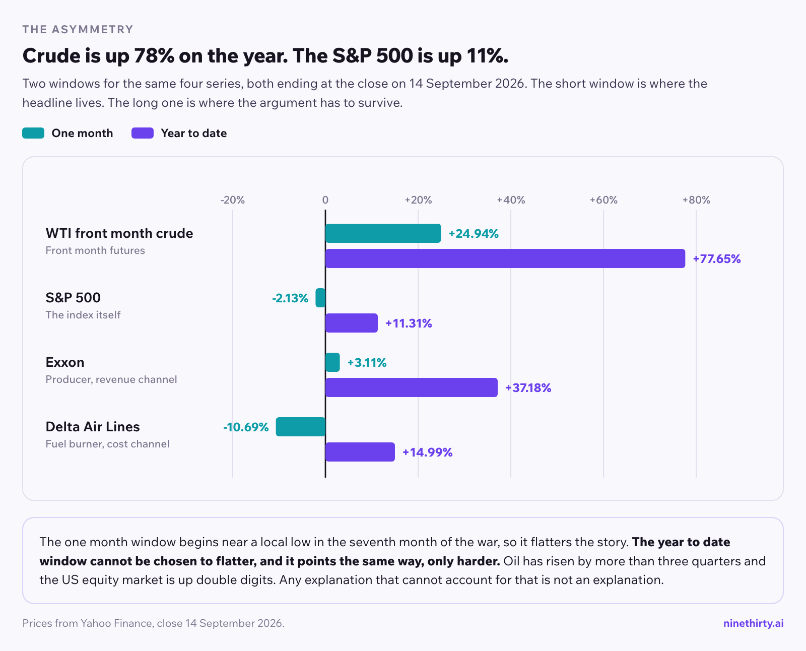
The war began in late February. Measured from the start of the year to 14 September, WTI is up 77.65 percent. Over that same stretch the S&P 500 is up 11.31 percent, the Nasdaq up 12.67 percent and the Dow up 9.07 percent.
Read that twice. Oil has risen by more than three quarters through seven months of a shooting war around the world’s most important oil chokepoint, and the US equity market is up double digits. Not down. Up. Whatever an oil shock does to equities, it plainly does not do the simple thing the headline implies, and any explanation that cannot account for a market rising through a 78 percent oil move is not an explanation.
That also disposes of a fair objection to the table above. A one month window can be chosen to flatter a story. The year to date figures cannot, and they point the same way, only harder.
Two details in that table carry more information than the rest.
The 10 year yield traded as high as 5.012 during the session, which equals the top of its own 52 week range. It closed below that, at 4.961, and it closed down on the day. So the correct statement is that the 10 year touched a 52 week high intraday, not that it sits at one.
The oil price is the October 2026 contract, which settles on 22 September 2026. Front month futures roll, so a chart of “the oil price” is a chart of successive contracts rather than one continuous instrument. For a move of this size that detail does not change the story, but it is the difference between a careful number and a loose one.
The month was front loaded. CNBC reported that on 10 September WTI gained 6.7 percent in a single session to settle at $102.48, its highest settle since 19 May, with Brent up 6.3 percent to $107.63, and that oil had advanced more than 18 percent in September to that point. The trigger was a sharp escalation in the first half of the month after a comparatively quiet August. CNBC reported that Iran’s Houthi allies in Yemen struck several energy facilities and other targets in Saudi Arabia that week, and that the US military had destroyed at least eight Iranian tankers since the preceding Saturday.
That is worth holding onto, because it tells you the twenty five percent is not a steady climb you could have averaged into. It is a handful of gap days around news, which is how geopolitical risk usually prices.
Why the three index numbers say almost nothing
Over one month the S&P fell 2.13 percent, the Nasdaq fell 2.03 percent and the Dow fell 2.44 percent. The spread between the best and the worst of them is about four tenths of a percentage point.
That is the finding. When the three major indices move together within half a point over a month, the move is not tech led and it is not value led. Nothing rotated. A broad, shallow drift lower is what you see when a shock is being absorbed rather than repriced.
It is worth noting that the single day tells a different story from the month. On 14 September the Nasdaq fell most and the Dow fell least, the reverse of the monthly ordering. One session of index ranking is noise. Anyone building a thesis on which index led on a given day is reading the tape backwards.
Why energy stocks do not track the oil price
Here is the part that surprises people who arrive after the headline.
Oil rose about twenty five percent over the month. The large energy producers did not.
Read the two columns against each other. Year to date these three have roughly tripled the index return. Over the last month, while crude was adding a quarter of its value, they added between one and six percent.
The timing matters. CRS dates the first leg of the oil move to the opening months of the war and sizes it at 50 percent between February and May 2026. By September the market had carried a high oil price in those valuations for months, which is part of why a further spike moved the shares far less than it moved the barrel.
Energy equities are not a leveraged bet on the spot price. They are a claim on a stream of future earnings, and that stream is priced off a long run oil assumption that moves far less than the front month contract. A producer’s shares rise when the market revises its view of oil over years. They do not rise one for one with a supply scare that the market expects to resolve.
So the honest reading is narrower than it first looks. Over the last month these three were close to flat while crude added a quarter of its value. Over a longer window they have moved a great deal. The three month heatmap later in this post reads Exxon at 17.10 percent on the screener, against 37.18 percent year to date on the Yahoo series above, so a large share of the year arrived in the most recent quarter. What you cannot conclude from any of that is that a crude headline hands you an easy trade in the shares. The link runs through an assumption about oil over years, and that assumption moves on its own schedule.
Airlines are where the cost channel shows up
The second channel is much easier to see.
Against a broad market that fell about two percent, these two fell ten and thirteen. That is the cost channel doing exactly what the mechanism predicts, and it is a far cleaner expression of the oil move than the energy producers were.
The year to date column looks like a contradiction and is not. Delta is still up 14.99 percent on the year through seven months of expensive fuel, because demand, capacity discipline and fares drove the year while fuel drove the month. A cost channel is not a verdict on a business. It is one input repricing, and it shows up most clearly in the window where the input moved.
The asymmetry is the point. A twenty five percent crude move produced a three percent gain in Exxon and a thirteen percent loss in United. The cost side repriced harder and faster than the revenue side. That happens because fuel is a near term contractual expense for an airline, while higher crude revenue for a producer is a long dated and uncertain benefit.
The refined side is tighter than crude, which sharpens the effect. CNBC reported US pump prices at a Labor Day record and diesel expected to cross $6 per gallon for the first time. Jet fuel and diesel come off the same part of the barrel, so a distillate squeeze reaches airlines and freight harder than the crude headline alone suggests. When you see a crude number in a headline, the question for a fuel burning company is what happened to refined products, which is often a larger move.
What a five percent 10 year yield does to the rest
The third channel is the one that reaches stocks with no connection to oil at all.
Energy prices feed inflation data, inflation data shapes rate expectations, and rate expectations set the long bond. With the 10 year touching 5.012 intraday, the discount rate applied to distant earnings is at the high end of its own year. Companies whose value sits mostly in earnings many years out feel that more than companies earning cash today.
This channel is also why a broad two percent drift can happen without any sector story. It is not selling energy consumers and buying energy producers. It is marking everything down slightly.
TLT, the long dated Treasury ETF, is the cleanest single instrument for watching this channel, because it is duration with no company attached. If you want to know whether an equity move is about rates or about something else, that is the first thing to look at.
What the VIX is and is not saying
VIX closed at 17.10, up 7.95 percent on the day and about twenty percent over the month.
A twenty percent monthly rise in the VIX sounds alarming until you place it. The index has traded between 13.38 and 35.30 over the past year. At 17 it sits near the lower end of its own range, roughly half its 52 week high. It rose from a very low base, which is what “up twenty percent” describes here.
The VIX measures the price of options on the S&P over the next thirty days. It is a measure of expected movement, not of direction. A rising VIX with a flat index means traders are paying more for protection while not actually selling much. That is a market pricing a risk it has not yet acted on, which is a different state from a market in a selloff, and it is worth distinguishing before you change what you hold.
How to track the oil channel with a screener
The practical question is how to keep this visible without watching five tabs.
Start from sectors, not from stocks. The sector heatmap answers the first question, which is whether the move is concentrated or broad. If energy is green and everything else is mildly red, channel one and channel three are the likely reading. If energy is green and transport is deeply red, channel two is probably live too. This takes a few seconds, and it narrows the candidates rather than confirming one.
Here is what that looked like in practice. The map below is coloured by three month performance and was read on 15 September 2026, so it is a different window and a different source from the one month and year to date tables earlier in this post. Keep the three windows separate in your head. Over those three months energy is the most uniformly green block on the map, while technology, the largest block, is mostly red with its two biggest names as the exception. That alone answers the concentrated or broad question in about two seconds.
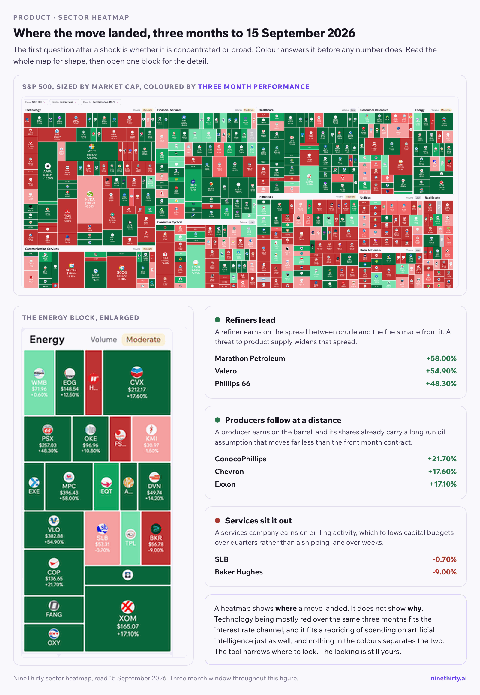
Then look inside the green block, because the dispersion within it carries more than the block itself does. Over the same three months Marathon Petroleum is up 58.00 percent, Valero 54.90 percent and Phillips 66 48.30 percent. Exxon is up 17.10 percent, Chevron 17.60 percent and ConocoPhillips 21.70 percent. The oilfield services names sit at the bottom of the block, with SLB down 0.70 percent and Baker Hughes down 9.00 percent over the same period.
Refiners at the top, producers in the middle, services at the bottom. That ordering is not noise. A refiner earns on the spread between crude and the fuels made from it, and a threat to product supply widens that spread. A producer earns on the barrel, and its shares already carry a long run oil assumption, which is the point the table earlier in this post makes. A services company earns on drilling activity, which follows capital budgets over quarters rather than a shipping lane over weeks. One sector, three different businesses, three different answers to the same shock.
The heatmap shows where a move landed. It does not show why it landed there. Technology being red over those three months fits the rate channel, and it fits a repricing of spending on artificial intelligence just as well, and nothing in the colours separates the two. That is the honest use of the tool. It narrows where to look. The looking is still yours.
Use news as a condition, not as a feed. News screening composes into a query alongside price conditions, using newsCount with a sentiment, an impact and a category, over an interval such as 1day or 1week. That turns “which of my names has taken negative coverage this week” into a filter rather than an afternoon of reading. The prebuilt Negative News Reaction and News Gap screens in the screener are the ready made versions. News screening at monthly and weekly intervals is in the free tier, and daily and hourly intervals come with Alpha.
Separate the cost side from the revenue side. Build two saved screens rather than one. A revenue side screen looks for producers holding a trend, using conditions such as Latest Daily Close > Latest Daily SMA 50 combined with a liquidity floor. A cost side screen looks for fuel intensive names breaking down, inverting the same trend condition. Running them side by side shows you the spread between the channels, which is the thing that actually moved.
Check the calendar before you act on any of it. The events calendar carries the earnings dates, and an airline reporting in three days is a different trade from the same chart with a clear month ahead. It also carries return analysis around each company’s previous announcements, which tells you how that specific stock has behaved into and out of its own reports.
Ask the question in words when you do not know the filter. Dr. Market takes a plain question about a market move and answers from the same data the screener runs on. It analyses. It doesn’t recommend.
What a screener will not do here, and what to do instead
This is the section most articles skip, and skipping it is how people build screens that quietly do nothing.
There is no oil price field. The metric categories cover technicals, fundamentals, financial ratios, price action, company information and sector aggregates. Crude is not among them, because the universe is US equities and ETFs. You cannot write a condition that reads “when WTI is above 100.” What you can do is screen the equities that respond to it, which is what the two screens above are for.
There is no geopolitics filter. No condition expresses “companies exposed to shipping through a specific waterway.” The nearest honest substitute is the news category and sentiment conditions, which catch the coverage rather than the exposure. Treat that as a starting list to read, not as an exposure map.
There is no forward events condition. You cannot filter for “no earnings in the next five days.” Run the screen, then take the short list to the calendar. The order matters and it is the wrong way round in most people’s process.
Backtesting runs on the saved screen itself, using the conditions you already built, with no separate scripting language. It reports, per stock, how often the screen triggered, the historical win rate, the average return and which holding period performed best, with a trade log behind each row. The useful second run removes one condition and repeats it, because if the numbers do not move, that condition was decoration. The free tier covers 50 candles of history and two runs a day, and Alpha lifts that to 500 candles and unlimited runs. Trading involves risk of loss. Backtested performance is hypothetical, does not reflect actual trading, and does not indicate future results.
One more caution specific to this situation. A screen built during an oil spike and backtested over a period containing that same spike will look excellent. That is the sample telling you about itself. Check whether the result survives the months before the shock.
What to watch from here
Three things, in the order they would actually change the picture.
The shape of the oil curve, not just the price. A front month contract far above the months behind it says the market expects the disruption to pass. If the later contracts start rising to meet the front, the market has changed its mind about duration, and that is when the long run assumption underneath energy share prices moves.
The 10 year at five percent. It touched 5.012 and closed below it. A sustained move above that level reaches far more of the market than the oil price does, because channel three does not need a company to consume or produce anything.
The gap between producers and consumers of fuel. Right now it is wide, roughly three percent for Exxon against thirteen percent down for United over the same month. If that gap narrows while crude holds its level, the market is deciding the shock is temporary. If it widens, the market is pricing a longer one.
Behind all three sits the question of duration. The Congressional Research Service frames the range honestly: the present situation could persist for as long as both sides judge they can bear the cost, and the longer conditions in the Strait stay uncertain, the harder the supply shortfall is to compensate for. Spare capacity and strategic reserves are buffers with a floor, not a fix. That is the variable the equity market is really pricing, and it is the one nobody can forecast.
Build the process, not the prediction
You are unlikely to forecast an oil shock. You can decide in advance which channel you are exposed to, and you can build the two or three saved screens that make the answer visible in a minute rather than an afternoon.
The mechanism in this post is durable. The numbers are a snapshot from one September afternoon and will be stale soon, which is exactly why the channels are worth learning and the levels are not worth memorising. An oil move splits the market into companies that sell it, companies that burn it, and companies that merely borrow in the world it repriced. Knowing which of those you hold is most of the work.
Start with the sector heatmap when the headline breaks, then go to the screener with a specific question rather than a general worry.
DISCLAIMER: This article is for educational and informational purposes only. It does not constitute investment advice or a research report.