Every September someone reminds you that stocks fall in September. Every May someone repeats the rhyme about selling and going away. Both claims contain something real. Neither survives the full record intact.
We pulled 75 years of S&P 500 monthly closes and calculated what happened month by month, from 1951 through 2025. Below is the full table of S&P 500 monthly returns, the parts of the seasonal folklore that hold up, the parts that faded, and the single number that explains why a calendar page should never be the reason you place a trade.
What is stock market seasonality?
Stock market seasonality is the study of whether returns cluster by calendar position rather than by news. It asks a narrow question: across many years, has a particular month, week or holding window produced returns that differ from the rest of the year?
Three numbers answer that question, and you need all three.
Average return is the arithmetic mean across every year in the sample. It is the number most articles quote and the number most easily distorted, because a single crash year moves it a long way.
Median return is the middle year. It tells you what a typical year looked like, and it ignores the extremes.
Positive rate, also called the hit rate or win rate, is the share of years that finished higher. It tells you how often the pattern showed up at all.
When those three numbers agree, you are looking at a stable seasonal pattern. When they disagree, the disagreement is the finding. Hold on to that idea, because September is about to demonstrate it.
Which months have been the best and worst for the S&P 500?
S&P 500 price returns, month end to month end, 1951 through 2025. Every month has 75 observations.
| Month | Average | Median | Positive rate | Best year | Worst year |
|---|
| January | +1.07% | +1.59% | 60.0% | +13.18% | -8.57% |
| February | -0.04% | +0.27% | 53.3% | +7.15% | -10.99% |
| March | +1.05% | +1.52% | 64.0% | +9.67% | -12.51% |
| April | +1.39% | +1.15% | 69.3% | +12.68% | -9.05% |
| May | +0.32% | +1.05% | 61.3% | +9.20% | -8.60% |
| June | +0.28% | +0.09% | 56.0% | +8.23% | -8.60% |
| July | +1.31% | +1.34% | 60.0% | +9.11% | -7.90% |
| August | 0.00% | +0.58% | 54.7% | +11.60% | -14.58% |
| September | -0.71% | -0.35% | 44.0% | +8.76% | -11.93% |
| October | +0.90% | +1.13% | 58.7% | +16.30% | -21.76% |
| November | +1.89% | +2.15% | 70.7% | +10.75% | -11.39% |
| December | +1.37% | +1.35% | 72.0% | +11.16% | -9.18% |
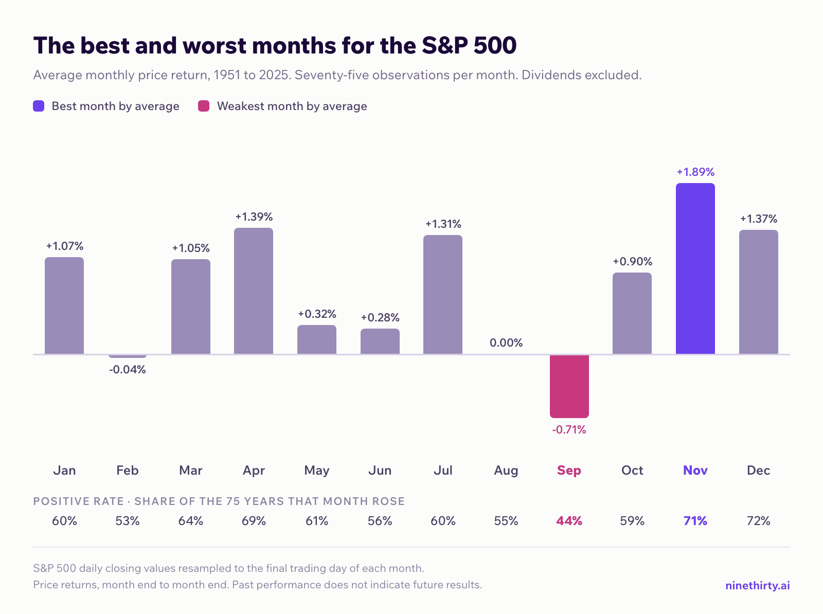
Four things stand out.
November is the best month for stocks by average, at +1.89%. It has the highest median too, at +2.15%. Its positive rate of 70.7% is second, behind December.
December is the most consistent, at a 72.0% positive rate. Its average is lower than November’s, but it finished higher in 54 of 75 years.
September is the weakest month on every measure. It has the lowest average, at -0.71%, the only negative median, at -0.35%, and the only positive rate below 50%, at 44.0%. February is the only other month meaningfully below zero, at -0.04%. August finishes a fraction under too, at -0.002%, which the table rounds to 0.00%.
February is the second weakest month, and almost nobody says so. Its average is -0.04% and its positive rate is 53.3%, both worse than August and far worse than the popular villain October. October’s average is a healthy +0.90%. What October owns is the worst single month in the entire sample, -21.76% in 1987, which is why it feels dangerous even though it usually is not.
What is the September effect, and is September really the worst month for stocks?
The September effect is the name given to the market’s tendency to fall in September. It is the most durable seasonal pattern in the table, and it is weak in every slice of the record. Split the sample in half and the average is -0.70% in 1951 through 1988 and -0.72% in 1989 through 2025. Very few seasonal patterns survive that test. September does.
The consistency has changed, though. September’s positive rate was 39.5% in the first half and 48.6% in the second. The month is still the worst in the calendar, and it is no longer a month that reliably falls.
You will read many explanations for the September effect. Portfolio rebalancing after the summer, tax loss harvesting, thin holiday liquidity, plain investor psychology. Treat all of them as unverified. What the data supports is the pattern, not the cause. We would rather show you a clean number than a tidy story.
Does “Sell in May and Go Away” still work?
The rhyme says leave the market at the start of May and return at the start of November. Academics call the same idea the Halloween indicator, or the Halloween effect, after the date you are supposed to buy back in. Here is what those two windows produced from 1951 through 2025.
| Window | Average | Median | Positive rate |
|---|
| November to April | +6.97% | +6.57% | 76.0% |
| May to October | +2.00% | +2.41% | 65.3% |
| Difference | +4.97% | +4.16% | +10.7pp |
The gap is real and it is large. The winter half returned roughly three and a half times the summer half.
The verb is wrong, though. May to October did not lose money. It averaged +2.00% and finished higher in 65.3% of years. “Sell in May” describes a weaker tailwind, not a headwind.
In the last 20 years the case weakens further. From 2006 through 2025, November to April averaged +6.12% with a 70.0% positive rate, and May to October averaged +3.85% with a 75.0% positive rate. The summer half was positive in 15 of the last 20 years, more often than the winter half. Anyone who left the market every May since 2006 sat out a run of profitable summers and paid transaction costs and taxes for the privilege.
May itself tells the same story. From 1951 through 1988 it averaged -0.55% with a 47.4% positive rate. From 1989 through 2025 it averaged +1.21% with a 75.7% positive rate. The month at the centre of the rhyme reversed.
Is the January Effect still real?
It has faded a long way.
| Period | January average | Positive rate |
|---|
| 1951 to 1988 | +1.56% | 60.5% |
| 1989 to 2025 | +0.57% | 59.5% |
| 2006 to 2025 | +0.24% | 55.0% |
The average fell by roughly 85% from the first period to the last. January is still positive more often than not, but it is no longer a standout month. Seven months beat it in the 2006 to 2025 sample, led by July at +2.44% and November at +2.09%.
This is the most common fate of a widely published seasonal pattern. The standard explanation is that positioning moves ahead of a known pattern until the edge compresses, but that is an explanation, not something this data proves.
Have seasonal patterns changed over time?
Yes, and in more places than January.
- May flipped, from -0.55% and a 47.4% positive rate to +1.21% and a 75.7% positive rate.
- August weakened, from +0.42% to -0.43%.
- October strengthened, from +0.46% to +1.35%.
- July strengthened, from +0.98% to +1.66%, and it is the strongest month of the last 20 years at +2.44%.
- September did not move, holding at roughly -0.7% in both halves.
That mix is the honest answer to “does seasonality work”. Some patterns are structural enough to persist across 75 years. Others were artifacts of a market that no longer exists. You cannot tell which is which by reading a headline. You have to look at the sub-periods.
What happens to the stock market in a midterm election year?
Seasonality has a four year version as well as a twelve month one. The US midterm election falls in every year that is divisible by two but not by four, which gives 19 occurrences inside our sample, from 1950 to 2022.
| Window | Midterm years | All other years |
|---|
| May to October of the midterm year | -0.59% average, 50.0% positive | +2.81% average, 70.2% positive |
| November to April, spanning the election | +14.79% average, 100% positive | +4.32% average, 67.9% positive |
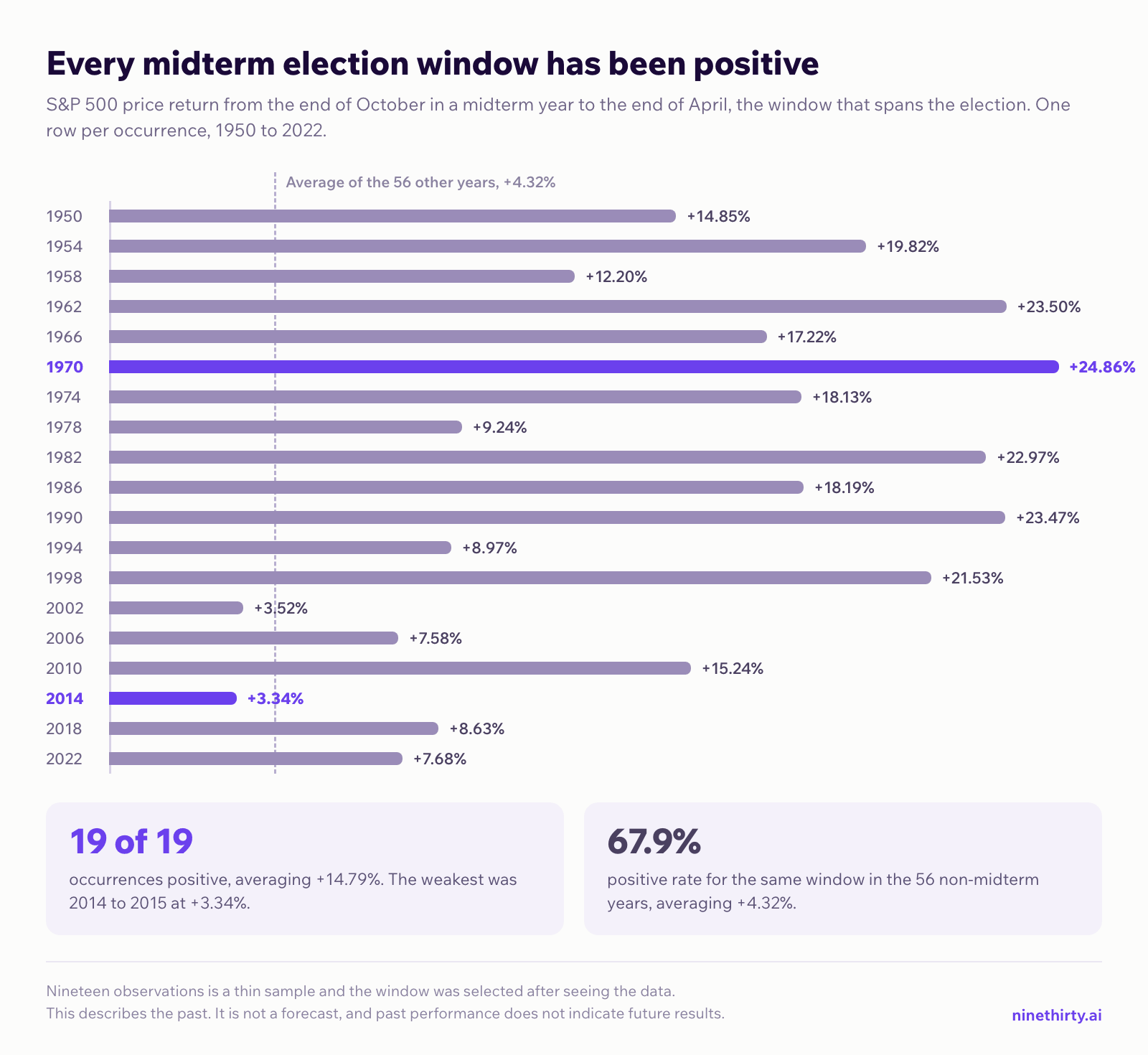
Be precise about the second window, because the label matters. It runs from the last close in October to the last close in April. The election itself falls in the first week of November, so the window straddles the vote rather than starting after it. Roughly the first week of the return is pre-election.
The summer of a midterm year was the weakest summer in the calendar, at -0.59% against +2.81% for every other year. Then the window across the election was positive in 19 of 19 occurrences, averaging +14.79%. The weakest instance was November 2014 to April 2015 at +3.34%. The strongest was November 1970 to April 1971 at +24.86%.
Now apply this article’s own discipline to that number, because a 100% hit rate is exactly the kind of statistic that should make you suspicious rather than confident.
The sample is 19. Measured against the 67.9% base rate of the 56 non-midterm windows, 19 straight winners has a probability of about 0.06% by chance, so luck alone is a poor explanation. But an unlikely result is not a reliable one, and 19 observations is a thin foundation for any decision. The pattern also selects a window and a year type after seeing the data, which is the setup that produces impressive statistics that then stop working.
The next occurrence of this window begins in November 2026. Nineteen for nineteen describes the past. It is not a forecast, and a twentieth observation tells you almost nothing on its own.
Why seasonality alone is not a trading strategy
Here is the number that should end the argument.
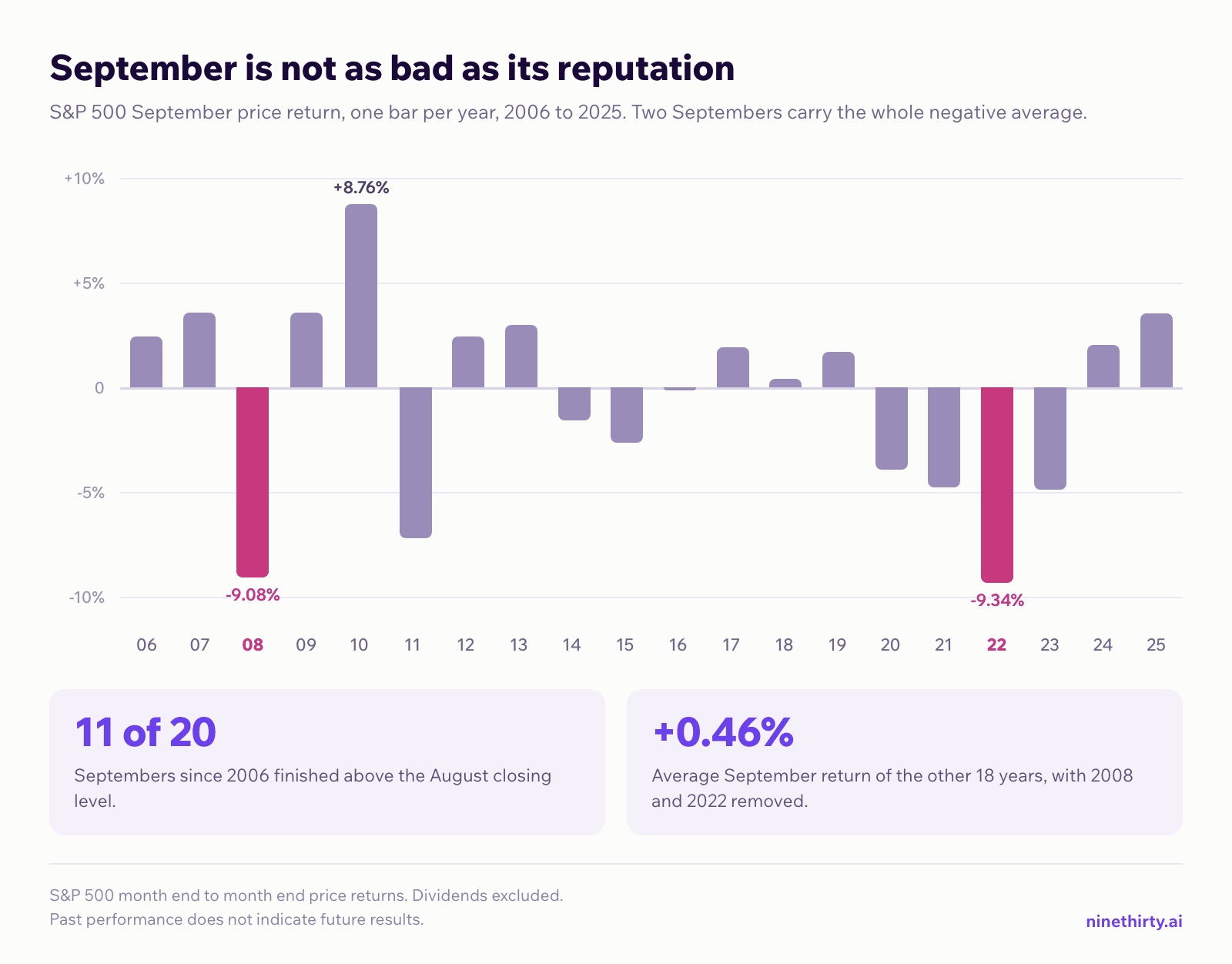
Over the last 20 years, September in the S&P 500 averaged -0.50%. Its median was +1.07%. It finished higher in 11 of 20 years.
Read that again. The average says September falls. The median and the positive rate say the typical September rises. Both are correct, and they describe the same 20 years.
The explanation is concentration. Two Septembers carry the whole result: 2008 at -9.08% and 2022 at -9.34%. Remove those two years and the remaining 18 average +0.46%. The seasonal average is not describing a September tendency. It is describing two crises that happened to land in September.
This is the core limitation of every seasonal statistic, and it applies to the strong months too. A +1.89% November average does not mean November delivers +1.89%. It means the middle of a wide distribution sits there, with a worst case of -11.39% inside the same sample.
So seasonality cannot tell you what will happen. What it can do is tell you whether the calendar is helping you or working against you, and that is a genuinely useful input. A setup that already looks good on price, volume and fundamentals is worth more in a month with a 72% positive rate than in a month with a 44% one. The calendar adjusts your confidence and your position size. It does not generate the idea.
How to use seasonality as a filter rather than a signal
Four rules keep seasonality in its proper place.
Read the median and the positive rate before the average. If the average is strong and the positive rate is near 50%, a small number of years is doing the work. Open the year by year returns and look at them.
Check the sub-periods. A pattern that only exists before 1990 is a historical fact, not a research input. Compare the recent decade against the full sample and prefer patterns that appear in both.
Require the trade to stand on its own first. Seasonality should confirm an idea you already have. If the only reason for a position is the month on the calendar, there is no reason for the position.
Size for the worst case, not the average. Every strong month in the table above has a double digit loss somewhere in its history. Your risk management has to survive that year, because averages do not protect capital.
How to run seasonality analysis on NineThirty
Seasonality analysis on NineThirty works across the Nasdaq 100, an index Nasdaq itself publishes, and the S&P 500, with a separate mode for indices. It runs on individual stocks, not just on the index, which is where the article you just read stops being useful and your own research begins. It is available through three views.
Stock Performance ranks a chosen universe by how each stock has historically performed in a selected month. Alongside Avg return it reports Positive rate, Positive years as a plain fraction, and a Consistency score that combines win rate, average return and the stability of returns. You can run it in either direction, for months a stock has historically risen in and months it has historically fallen in.
The Historical Swing Screener narrows a whole month down to a specific scenario: enter on a chosen date, hold for a chosen period. It returns Avg historical return, Positive rate, Positive years, and the Highest and Lowest historical return across every occurrence. Expand any row and you get the return for each individual year, plus the Median, the Standard deviation and the Window. That expansion is the fastest way to find out whether an attractive average is broad based or is two good years in disguise, which is exactly the September problem in miniature.
The Monthly heatmap puts years down the rows and January to December across the columns for a single stock or index. Average monthly performance sits along the top, the positive percentage along the bottom, and yearly CAGR gives the surrounding context. It also surfaces the Best historical month, the Worst historical month and a Typical monthly range for the month you are looking at.

Apply the article’s own test to that screenshot. Five occurrences is a thin sample, and the 100% positive rate on the Palantir Technologies row is precisely the number you were just told to distrust. That is what the expansion is for. It shows you the five years, so you can judge for yourself whether they are a pattern or a short run.
Seasonality is one surface inside the wider NineThirty screener, which is the point. The workflow that matters is finding a candidate on price, volume and fundamentals first, with your own filters or a prebuilt screen, then checking the calendar before you commit to it.
How we calculated this S&P 500 seasonality data
Source: daily closing values of the S&P 500 index from Yahoo Finance, resampled to the final trading day of each month.
Sample: January 1951 through December 2025, 75 complete calendar years, 75 observations per month.
Returns: month end close to month end close. These are price returns and exclude dividends, so every figure understates the total return an investor would have received. The relative ranking of months is affected very little by this, because dividends do not cluster in the way returns do.
The sample starts in 1951 rather than 1950 because a January 1950 return would need a December 1949 close, which the source series does not carry. Starting in 1951 keeps every month at an identical sample size, which matters when you compare months against each other.
Sub-periods used above: 1951 to 1988 is 38 years, 1989 to 2025 is 37 years, and 2006 to 2025 is 20 years.
What to take away
September is genuinely the weakest month, and in the last 20 years it still rose more often than it fell. November and December are genuinely the strongest, and both have double digit losses in their history. The winter half of the year genuinely outperforms the summer half, and the summer half still makes money. February deserves more suspicion than it gets, and October deserves less.
None of that is a strategy. All of it is context, and context is worth having when you are deciding between two setups that look equally good on the chart.
Trading involves risk of loss. Backtested performance is hypothetical, does not reflect actual trading, and does not indicate future results.
DISCLAIMER: This article is for educational and informational purposes only. It does not constitute investment advice or a research report.